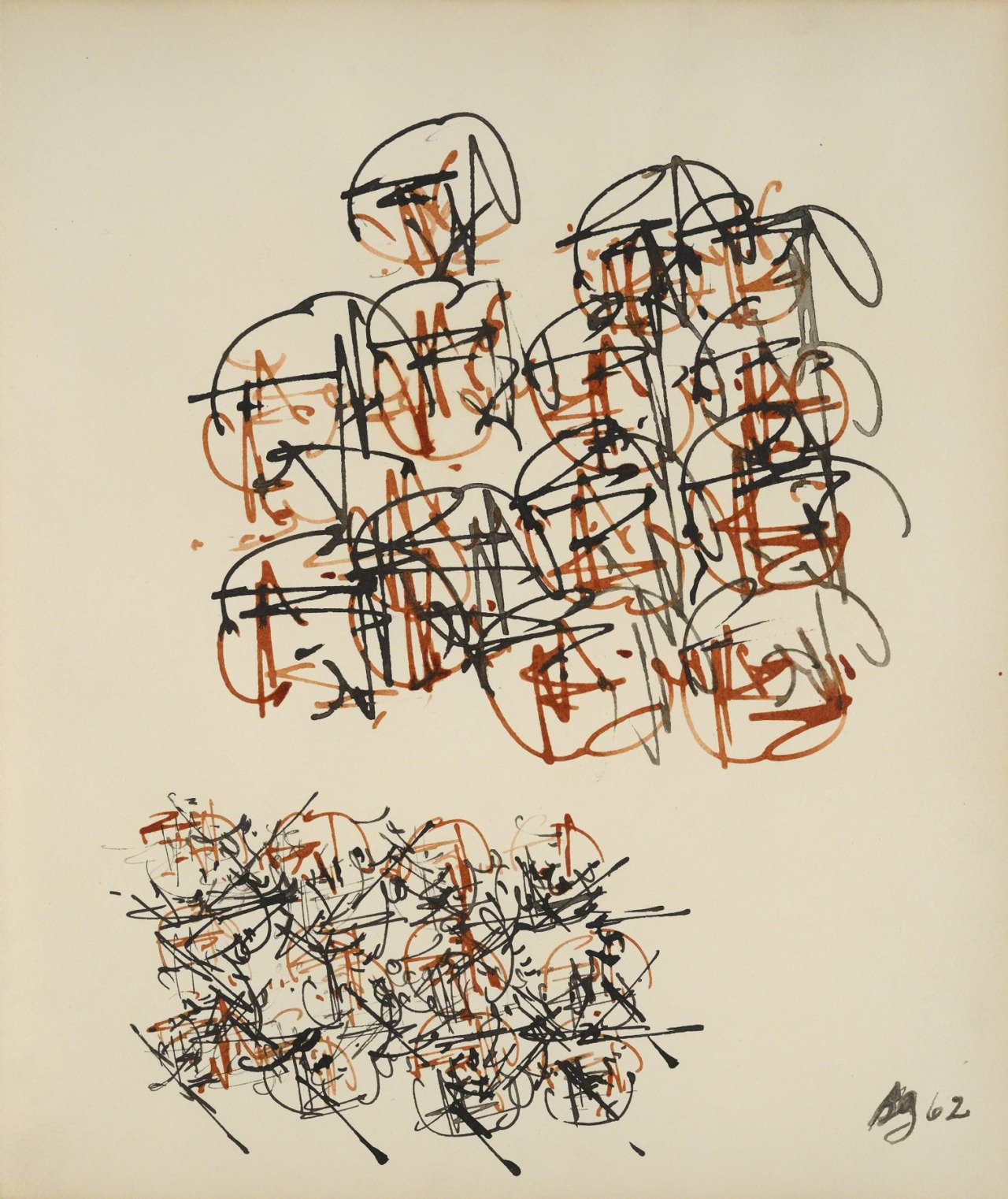
❝ I first saw Gysin’s calligraphic works as abstract paintings. Gysin told me they were paintings of light and, once I saw they were depictions of light striking things, I began to see people, trees, landscapes, all kinds of vistas that were realities I hadn’t seen before. He basically paints portals that shift our perception as we look, changing the way we see things. ❞ *
visual art
advertised versus actual
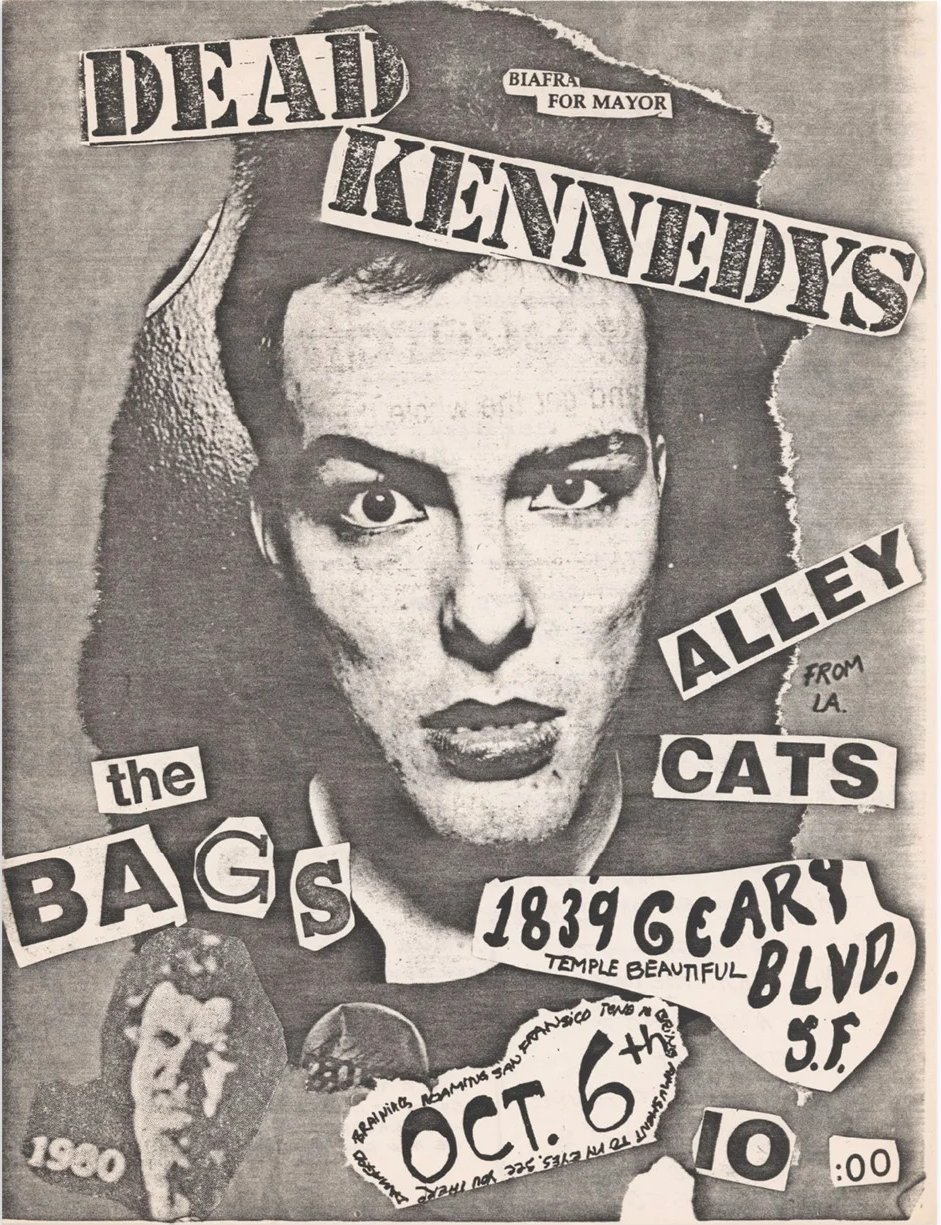
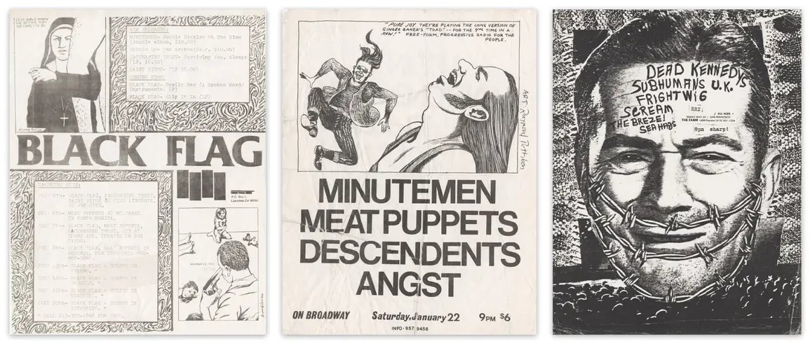
❝ Aside from a Xerox machine, the key materials needed for a punk rock flyer tended to include: newspapers and magazines from which text and images could be ripped and reassembled; pens with which dates, times, and illustrations could be scrawled; and glue to assemble the collage that would be flattened into a photocopy. In addition to appropriating existing imagery, some emerging punk artists created their own, playing with the visual vernacular in the form of cartoons and drawings. Raymond Pettibon, perhaps best known for creating the barcode-like Black Flag logo, created photocopy-ready pen and ink illustrations, taking formal cues from traditional comics but infusing his images with subversive themes, dialogue, and settings. Others, like Winston Smith, who created much of the Dead Kennedys’ most recognizable artwork, collaged already lo-fi newspaper imagery into disturbing juxtapositions of advertised versus actual life. When run through the photocopier, toner smears, and other imperfections made these images literally darker, producing an oddly nocturnal final copy that perfectly reflected the milieu and mood of punk. ❞ *